
Imagine a UK investor reviewing their statements: their portfolio beat the FTSE 100 last year, yet they lost significantly more than the market during downturns. Why the disconnect? Portfolio Historical Performance is more than just a profit tally; it’s a diagnostic tool revealing hidden risks and unintended bets within your strategy. Focusing solely on the bottom line risks your wealth, as unseen exposures can lead to unexpected, painful losses.
This article answers a crucial question: How can you transform raw return data into a clear understanding of your portfolio’s true risk profile? You’ll learn to decode what your returns are really signalling — uncovering hidden volatility, sector concentrations, or factor tilts you never intended. We’ll show you, step-by-step and without complex jargon, how to analyse past performance like a professional, turning history into actionable insight for smarter future decisions. No prior expertise needed.
Why Performance Forensics Matters to Your Wealth
Historical returns aren’t just profit-and-loss statements. They’re diagnostic tools that reveal your portfolio’s hidden risk exposures and unintended bets. Think of performance analysis as a forensic exercise in risk attribution — where every percentage point tells a story about what really drove your results.
Consider the S&P 500’s recent swings: a dazzling double-digit surge one year, followed by a sharp drop the next. Surface-level returns like these mask underlying volatility. Chasing last year’s winners without understanding their risk drivers is like buying a car without checking the engine. You might enjoy the ride temporarily, but breakdowns are costly.
Aggregated returns can be equally deceptive. Take the classic 50/50 portfolio (half equities, half bonds). Over recent decades, it delivered a respectable single-digit compound annual growth rate (CAGR). Yet that smooth average conceals brutal realities: the dot-com crash, global financial crisis, and inflation spikes that hammered bonds. Without dissecting how those returns were achieved, you’d miss critical risks like interest-rate sensitivity or equity concentration. Our Compound Interest Calculator shows how such hidden volatility erodes long-term wealth — a portfolio swinging between +20% and -10% annually grows far slower than one with steady 7% returns, even with identical CAGRs.
Misreading of returns breeds unintended bets. After a strong run, many investors pile further into equities, amplifying their exposure right before the next downturn. Why? They focused on what they earned, not why. A "diversified" fund might secretly be a 40% tech bet, or a "low-risk" bond portfolio might hide interest-rate traps. Performance forensics uncovers these exposures by reverse-engineering returns into their risk components:
- Volatility: Did your returns come with gut-wrenching swings?
- Sector concentration: Was your success reliant on one hot industry?
- Factor tilts: Were you accidentally betting on risky small-caps or high-debt firms?
Tools like the Sharpe Ratio help quantify these trade-offs, measuring returns per unit of risk. Meanwhile, our Portfolio Calculator lets you stress-test allocations against historical crises.
This forensic mindset transforms how you interpret expectations. While diversified portfolios are projected to return around 6% annually over the next decade, that figure means little without context. Was it achieved through luck, leverage, or genuine skill? Did fees or taxes — like the UK’s 0.5% stamp duty on shares or up to 39.35% dividend tax — silently bleed returns?
Ultimately, analysing historical performance like a pro means treating your portfolio as a crime scene. Scrutinise the evidence. Trace the fingerprints of risk. Because understanding why you earned returns prevents you from gambling your wealth on invisible bets. For a deeper dive into balancing risk and reward, explore Markowitz Portfolio Optimisation: Plain English.
The Intuition: What Your Returns Are Really Telling You
Think of your portfolio’s historical returns like medical symptoms. A fever isn’t just "a high temperature" — it’s a clue pointing to infection, inflammation, or stress. Similarly, your returns aren’t just profit/loss statements. They’re encoded messages about your portfolio’s hidden risks and unintended bets.
For example, a strong cumulative S&P 500 return in the months after the Federal Reserve began cutting rates seems impressive. But that number alone is deceptive. It’s really telling you the portfolio was heavily exposed to interest-rate sensitivity. When rates fell, stocks soared — but if rates reversed, that same exposure could trigger losses. Like a patient whose symptoms vanish with medication, the return "cure" reveals the underlying condition: rate dependency.
This decoding exposes three common hidden risks:
- Sector concentration: A portfolio might appear diversified but lean heavily on one sector (e.g., technology). If tech stocks surge, your returns look strong — but you’re not diversified. You’re betting on a single industry.
- Factor tilts: Returns might be driven by biases toward growth stocks (which thrive in low-rate environments) or value stocks (which outperform during inflation). A strong headline S&P 500 return could mask a dangerous tilt toward one style.
- Geopolitical or leverage risks: Consider international equities during a bout of turmoil — a sharp surge over a few weeks followed by an equally sharp plunge. Those wild swings weren’t random. They signalled acute sensitivity to events like trade disputes or regional conflicts. Similarly, smooth returns that suddenly spike or crash may hint at hidden leverage amplifying gains and losses.
The "Aha! moment" comes when seemingly diversified portfolios underperform. Imagine holding REITs alongside global stocks and bonds. When rates rise, REITs often plummet due to their debt-heavy structures, dragging down your entire portfolio. Your returns whisper: "You thought you were diversified, but you’re secretly betting against rate hikes."
Pros treat returns as forensic evidence. They dissect them to answer: What risks did I actually take? Tools like the Sharpe ratio help quantify whether returns compensated you for volatility endured. A compound interest calculator shows how small return differences snowball over time — but only risk attribution reveals why those differences exist.
Your portfolio’s returns are its risk DNA. By learning to read them, you move beyond asking "Did I make money?" to "What hidden bet made — or broke — these returns?" Start by mapping your performance to market events (e.g., "Did my energy stocks crash when oil prices fell?"). Then, use a portfolio calculator to simulate how rate shifts or sector crashes might affect you. What feels like a return is really a story — and you’re the detective holding the clues.
Decomposing Returns: The Math Behind the Scenes
Think of your portfolio’s return as a puzzle: the total number is just the starting point — the real insight comes from breaking it into the pieces that created it.
Step 1: The Asset-Level Breakdown Start with the basic building block: your portfolio’s return ($R_p$) is the weighted average of all individual asset returns. Here, $w_i$ represents the weight of each asset (e.g., 20% in Apple shares), and $R_i$ is that asset’s return over the period. The formula is:
$$R_p = \sum (w_i \times R_i)$$
What this means is: multiply each asset’s return by its portfolio weight, then add up all those contributions. In other words, this says that a 5% return from your 20% Apple holding adds 1% (since $0.20 \times 0.05 = 0.01$) to your total return.
Example: Suppose your £100,000 portfolio holds 60% in U.S. stocks (returning 12%) and 40% in bonds (returning 3%). The math works as: $$R_p = (0.60 \times 0.12) + (0.40 \times 0.03) = 0.072 + 0.012 = 0.084$$ So, your total return is 8.4%. The stocks contributed 1.2% more than bonds — but this doesn’t reveal why stocks surged.
Step 2: The Factor-Level Forensics Assets don’t move in isolation. Their returns are driven by underlying risk factors like the broader market, interest rates, or industry trends. We use a factor model to dissect this:
$$R_p = \alpha + \beta_1 F_1 + \beta_2 F_2 + \ldots + \epsilon$$
What this means is: your return splits into four parts.
- $\alpha$ (alpha): Skill-based return, e.g., a stock picker’s genius.
- $\beta_1 F_1, \beta_2 F_2$: Returns from factor exposures. Here, $\beta$ is your portfolio’s sensitivity to a factor (e.g., how tech-heavy you are), and $F$ is that factor’s return (e.g., "tech stocks rose 8%").
- $\epsilon$ (epsilon): Noise — unexplained, asset-specific moves.
In other words, this says that your 10% return isn’t luck — it’s the sum of deliberate bets and hidden risks.
Illustrative example: a large-cap equity return of around 6.7% might decompose as:
- +6.0% from revenue growth
- +3.0% from share buybacks
- +1.7% from dividends
- -1.5% from dilution (new shares)
- -2.0% from falling valuations
- -0.5% from margin pressure
Notice how this reveals hidden drags: even strong revenue was partly undone by valuation cuts. Similarly, your own "10% return" might mask a heavy bet on a single factor — like tech or interest rates — that could vanish tomorrow.
Why This Matters to You Decomposing returns exposes your portfolio’s risk DNA. For instance, large-cap stocks have delivered strong annualised returns over the past decade — but if your fund replicated that via hidden leverage on tech (not skill), you’d face disaster when tech slumped. It also clarifies asset class diversification: spreading across equities, bonds, and alternatives reduces $\epsilon$-style surprises, but factor analysis shows if you’re truly diversified or just concentrated on, say, U.S. growth stocks.
Ultimately, this is how professionals analyse returns: not to celebrate past gains, but to autopsy the risks that drove them. Your statement might say "10% return" — but the maths whispers whether it was skill, luck, or a ticking time bomb.
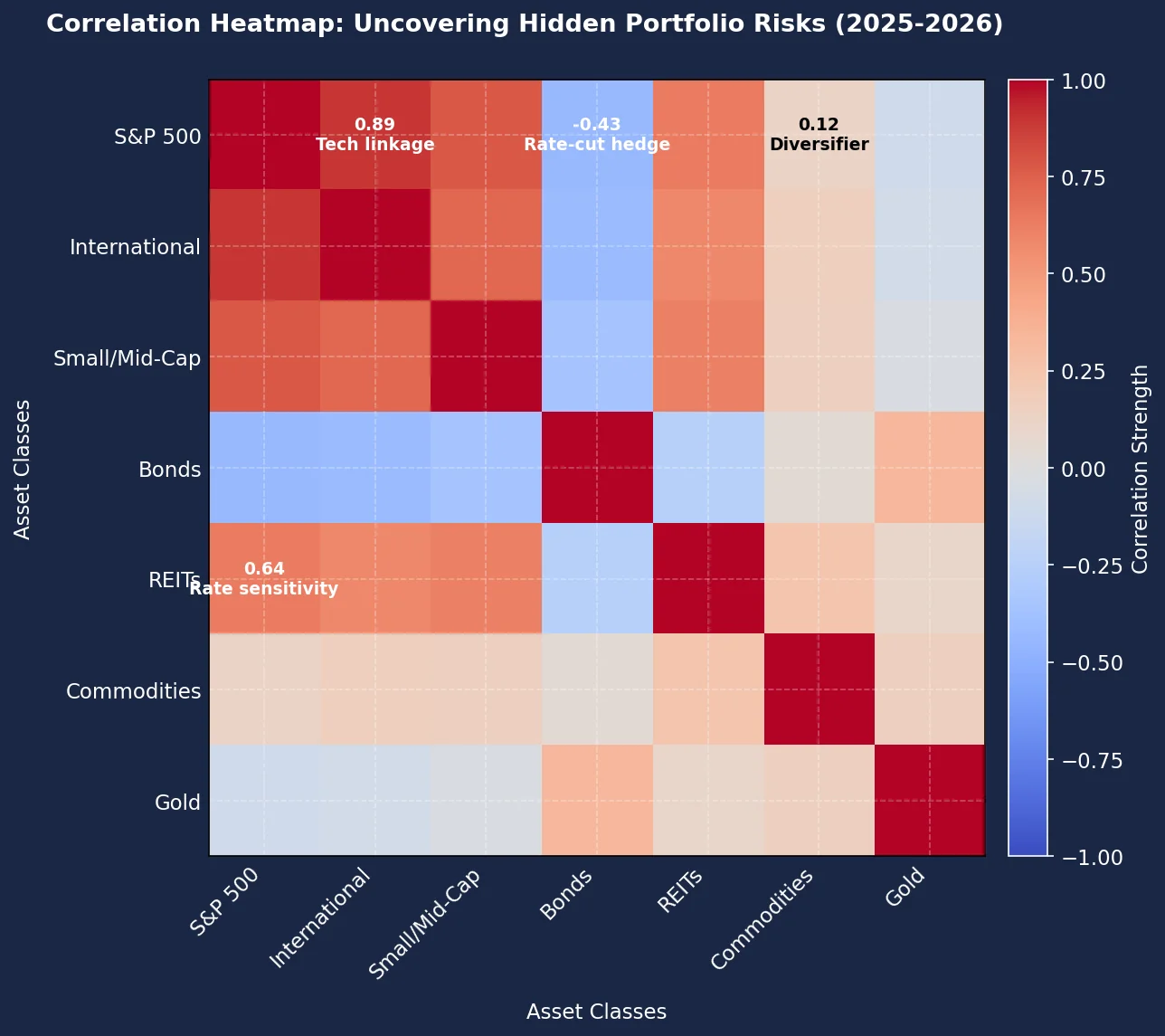
Visualising Hidden Risk Exposures
This visualisation transforms your portfolio's historical returns into a diagnostic map, exposing hidden risk exposures and unintended bets that drove performance. By decomposing returns into underlying factors — like volatility ($\sigma$), sector concentration, and factor tilts (e.g., value vs. growth) — it shifts focus from "How much did I make?" to "What unseen risks caused these results?". The 'Aha! moment' arrives when you realise returns encode your portfolio's risk DNA, revealing contradictions like a "diversified" fund acting as leveraged tech exposure. Finally, it unifies the tutorial's goal: analysing like a pro means treating performance data as forensic evidence for risk attribution, not just tracking profits.
Attribution Analysis in Action
So, how do you dissect your portfolio’s past performance to separate skill from luck? The answer lies in attribution analysis — a methodical breakdown of what actually drove your returns. Think of it as forensic accounting for your investments: instead of just tallying profits, you’re tracing each pound back to its source.
Start by isolating two core decisions: asset allocation (your mix of stocks, bonds, etc.) and security selection (your specific picks within those categories). For example:
- In 2025, shifting 20% of your portfolio from bonds to equities might have boosted returns if stocks surged. But was this foresight or fortune? If equities rallied broadly due to falling interest rates, your gain reflects market trends, not genius.
- Conversely, security selection drills into individual bets. Say your UK stock picks beat the S&P 500 over the same period. This suggests skill — but dig deeper.
This is where factor attribution exposes hidden risks. Your 2025 "outperformance" in tech stocks might not be stock-picking prowess — it could be unintended exposure to a single sector. If 80% of your equity allocation was silently concentrated in tech, and the sector spiked, you weren’t a savant; you were overexposed. Tools like our Sharpe Ratio Explained guide help contextualise whether those extra returns justified the risk.
Investor behaviour often amplifies these blind spots. Many UK investors exhibit home-market bias, overloading on domestic stocks like the FTSE 100. This feels "safe," but it’s an unintended bet on UK economic risks — when international equities sell off during geopolitical turmoil, a globally diversified portfolio would have softened the blow.
Practical takeaway:
- Map returns to your actual choices (e.g., "I chose UK dividend stocks") versus market noise (e.g., "The FTSE 100 rallied 15%").
- Audit concentration: If 40% of your "diversified" fund is in one sector, that’s a hidden bet.
- Factor in costs: Selling winners triggers Capital Gains Tax (rates up to 24%), eroding returns. Tax wrappers like ISAs shield gains — our Investment Calculator models this impact.
Tools like ARIA PM automate this detective work, adjusting for survivorship bias and costs so you see your portfolio’s true risk DNA. For long-term strategy, pair attribution with Markowitz Portfolio Optimisation principles — because understanding past returns is the first step to engineering future resilience.
Pitfalls and Limitations: What Returns Don't Tell You
While analysing historical returns reveals your portfolio’s hidden risk exposures — as we’ve established — treating them as a straightforward roadmap invites costly errors. First, past performance is not predictive. U.S. large-cap stocks delivered strong double-digit annual returns over the past decade, yet many forward forecasts call for materially lower single-digit returns in the years ahead. This divergence highlights how returns reflect temporary conditions — such as a small handful of technology firms driving an outsized share of recent index growth — not future guarantees. Extrapolating yesterday’s winners ignores shifting valuations, interest rates, or regulatory landscapes.
Second, fixating on short-term volatility distorts risk assessment. The 2026 market swings saw portfolios surge one month and plummet the next, tempting investors to abandon strategy. But short-term noise obscures structural risks like sector concentration or leverage. A better approach? Evaluate volatility through the Sharpe ratio, which adjusts returns for risk — our UK Investor’s Guide to the Sharpe Ratio explains this critical metric.
Third, gross returns ignore the silent wealth eroders: costs and taxes. Consider a £10,000 investment growing at 8% annually for 10 years. After costs, it becomes £21,589. But with a 1% annual fee, growth drops to 7% — yielding £19,672. That’s a £1,917 difference. Taxes amplify this: UK investors pay 0.5% Stamp Duty Reserve Tax (SDRT) on share purchases, while dividends exceeding the £500 allowance face taxes up to 39.35%. Capital gains over £3,000 incur 18-24% tax. Even moderate costs compound dramatically, as our Compound Interest Calculator demonstrates. Always model returns net of fees and taxes — or use tax wrappers like ISAs, which shelter £20,000 annually from CGT and dividend tax.
Data limitations further cloud interpretation. Backtest bias makes strategies appear flawless — they’re built on historical data they’re designed to fit. Meanwhile, black swan events (like unforeseen geopolitical crises) crush asset classes with no historical precedent, as international equities experienced in 2025. Alternative investments exemplify extrapolation risks: forecasts that favour private equity over commodities rely on volatile assumptions about illiquidity premiums and economic cycles. Treat them as scenarios, not promises.
Ultimately, historical returns are a forensic lens for diagnosing risk — not a crystal ball. They expose hidden bets and concentration, but cannot predict regime shifts or black swans. Pair them with forward-looking tools like Markowitz portfolio optimisation to balance risk across uncorrelated assets. For rigorous, cost-aware analysis, explore our suite of Free Tools — including an Investment Calculator that models real-world drags on returns. Because understanding what your returns conceal is the difference between luck and strategy.
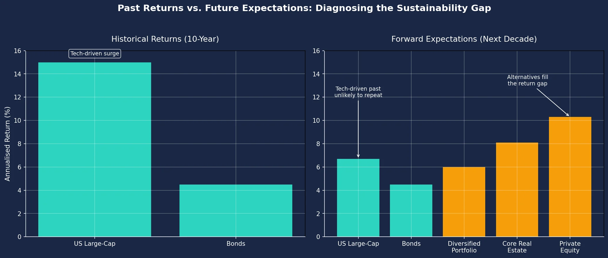
Blending History with Forward-Looking
Historical returns reveal your portfolio's hidden risk exposures — like how a strong U.S. large-cap surge might mask overreliance on tech — but forward expectations demand a reality check. This chart contrasts past decade returns with projected future performance, exposing unsustainable gaps. Savvy investors use this forensic lens to stress-test assumptions: does your portfolio depend on unrepeatable trends? Focus on the sharp drop projected for U.S. equities and the rising role of alternatives like private equity.
Your Action Plan: Becoming a Performance Detective
Step 1: Conduct Quarterly "Autopsies" Using Return Decomposition Start by dissecting your portfolio’s returns every three months. Don’t just note whether you gained or lost — break down what drove those results. For example:
- Was your 8% return last quarter due to a surging tech sector, or hidden leverage in your "safe" bond fund?
- Use free tools like our Investment Calculator to model how asset-class shifts impacted outcomes. If allocations to fixed income fell by 4.4% while equities surged, quantify how this amplified volatility.
Step 2: Hunt Unintended Bets Scrutinise concentrations that silently skew your risk. A large share of the average investor’s equity allocation often remains trapped in domestic or U.S. markets — a classic home bias blind spot. Ask:
- Does your "globally diversified" portfolio secretly have 60% in AI stocks?
- Did a 1.2% drop in alternative assets leave you overexposed to inflation? Cross-reference holdings with our Sharpe Ratio Explained guide to spot inefficient risk-reward trade-offs.
Step 3: Stress-Test Against Future Scenarios Historical returns reflect past risks — but resilience requires testing forward conditions. Model:
- "What if bonds only yield 4% for the next decade?"
- "How would a 20% emerging-market slump hit my concentrated portfolio?" Tools like our Compound Interest Calculator reveal how these shifts could erode long-term goals. For instance, £10,000 growing at 5% for 20 years becomes £26,533 — but at 4%, it drops to £21,911. That 1% gap costs you £4,622.
Step 4: Neutralise Home Bias with Global Data Use 2025-2026 international forecasts to rebalance. If U.S. equities dominate the bulk of your portfolio:
- Shift incrementally toward undervalued European or Asian markets showing stronger growth signals.
- Use principles from Markowitz Portfolio Optimisation to diversify without sacrificing returns.
Why This Works Pros don’t just track returns — they autopsy them. ARIA PM handles survivorship adjustment, cost modelling, and regime stress-testing automatically — so you can focus on interpreting results rather than building the simulation.
Your Edge You now know returns are a risk X-ray. Apply this forensic lens quarterly to expose hidden leverage, overconcentration, and complacency. Visit our Free Tools hub to start dissecting your portfolio’s returns and build truly resilient wealth.
Key Takeaways
- Treat historical returns as diagnostic data exposing your portfolio's hidden risk exposures and unintended bets, not just profit measurements.
- Avoid chasing last year's winning assets without first dissecting the specific risk factors (like volatility or sector concentration) that drove those returns.
- Recognise that a portfolio's smooth compound annual growth rate (CAGR) can mask severe underlying volatility and drawdowns, eroding long-term wealth.
- Identify unintended bets, such as discovering your "diversified" fund holds a 40% tech concentration or your "low-risk" bonds are highly sensitive to interest rates, by analysing return patterns.
- Reverse-engineer your portfolio's returns to attribute performance to specific risk components like volatility, sector bias, or factor tilts to understand its true behaviour.
| Aspect | Traditional Approach | Forensic Approach | Key Insight Gained |
|---|---|---|---|
| Primary Focus | Total profit/loss | Risk exposures behind returns | Returns as symptoms of hidden portfolio "illnesses" |
| Benchmarking | Surface-level comparisons to indices | Attribution analysis (asset/factor/selection effects) | Reveals if outperformance was skill or hidden risk |
| Risk Assessment | Basic volatility metrics | Exposure mapping (sectors, factors, leverage) | Identifies unintended bets like tech concentration |
| Outcome | "I gained 10% last year" | "My 10% gain was 80% leveraged tech exposure" | Exposes portfolio's true risk DNA |
| Investor Action | Adjust based on returns | Adjust based on risk drivers | Proactive risk management vs. reactive chasing |
Key Risk Factors Revealed by Return Decomposition
| Risk Factor | How It Distorts Returns | Warning Sign | Mitigation Strategy |
|---|---|---|---|
| Volatility | Extreme return swings | +30% returns with 40% drawdowns | Rebalance into lower-volatility assets |
| Sector Bets | Overperformance from single sector | Tech driving 70% of "diversified" portfolio | Enforce strict sector allocation limits |
| Factor Tilts | Returns clustered around style factors | Value fund actually tracking growth stocks | Audit fund holdings vs. stated mandate |
| Geographic Bias | Regional dominance in returns | 90% returns from U.S. despite global mandate | Reallocate to underrepresented regions |
| Leverage Effect | Amplified gains/losses | 15% returns with 2x market sensitivity | Reduce derivatives/borrowing |
Sources
- SEC: Investment Performance — SEC's overview of key performance metrics, benchmarks, and regulatory considerations for evaluating returns.
- FCA InvestSmart: Understanding price graphs — FCA guidance on interpreting historical returns, limitations of past data, and regulatory warnings for investors.
- FINRA: Evaluating Investment Performance — FINRA's educational resource on calculating returns, assessing risk-adjusted performance, and avoiding common pitfalls.
- Investopedia: Time-Weighted Rate of Return — Definition and step-by-step method for computing time-weighted returns, with practical examples.
- Bogleheads Wiki: Calculating Personal Returns — Community-developed guide to tracking portfolio performance using XIRR and benchmark comparisons.
- Morningstar: Portfolio Review in 7 Easy Steps — Professional framework for analysing risk-adjusted returns, diversification effectiveness, and benchmark alignment.


