
Sarah, a UK investor nearing retirement, stares at her pension pot: should she chase higher returns with FTSE 100 stocks or prioritise safety with bonds? The classic risk-return dilemma feels paralysing. Many turn to an Efficient Frontier Calculator, promising the optimal mix. But what if that "optimal" path is far less certain than it appears? Getting this balance wrong could mean insufficient retirement income or unnecessary exposure to market crashes. This article explores a critical question: how stable is that perfect risk-return trade-off the calculator shows you? You'll discover how tiny adjustments in estimated future returns can dramatically redraw the map of "efficient" portfolios, revealing just how fragile the calculated Efficient Frontier truly is and forcing a rethink of its reliability.
Intuition
Imagine you're planning a journey. You want the fastest route with the least traffic. The Efficient Frontier is like a map showing all the best possible routes for your investments — specifically, portfolios offering the highest expected return for each level of risk you might accept. This visual curve, central to Modern Portfolio Theory (MPT), was pioneered by Harry Markowitz. It demonstrates how combining different assets (like stocks and bonds) can reduce overall risk through diversification, without necessarily sacrificing returns. Think of it as finding the "sweet spot" where you aren't taking on unnecessary danger for your potential rewards.
But here’s the catch: this elegant curve isn't carved in stone. It’s drawn using estimates — predictions of future returns, volatility, and how assets move in relation to each other. Change these inputs even slightly, and the entire frontier can warp dramatically. For instance, if new economic data suggests UK equities might return 7% annually instead of 7.5%, portfolios that appeared optimal might suddenly fall below the curve, exposing you to more risk for the same return. A shift as small as 0.5% in expected returns can completely reshape what looks "efficient". This sensitivity highlights a sobering truth: the frontier is fragile, built on forecasts that are inherently uncertain.
Consider a practical example. You use an efficient frontier calculator to model a £10,000 investment split between UK shares and government bonds. The tool suggests a 60/40 mix is optimal. But if you adjust the bond return estimate downward by just 0.3% — perhaps due to changing interest rate expectations — the calculator might now flag a 50/50 split as superior. Minor input tweaks alter the entire efficient frontier graph, questioning how "optimal" any single portfolio really is. This isn't theoretical nitpicking; portfolio management software is widely used, yet these tools all grapple with this foundational instability.
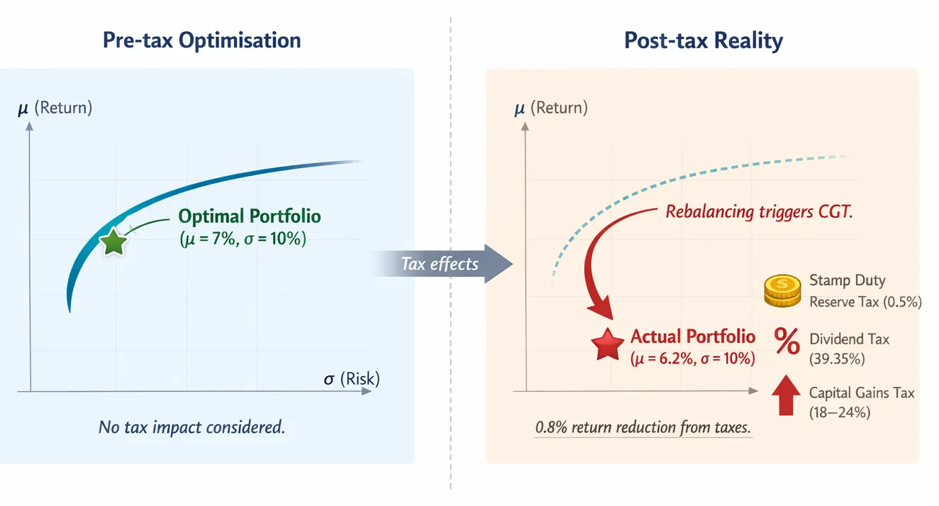
Taxes add another layer of complexity the frontier typically ignores. UK investors face real-world costs like the 0.5% Stamp Duty Reserve Tax on share purchases, or dividend taxes up to 39.35%, which directly erode net returns. An efficient frontier chart plotting pre-tax returns might look the same after a regulatory change — but your actual profits could shrink significantly. Tools like our Portfolio Calculator let you model these impacts, but the core frontier remains vulnerable to input shifts.
Ultimately, the Efficient Frontier is invaluable for visualising the risk-return trade-off and the power of diversification — explore our plain-English guide to Markowitz Portfolio Optimisation for more. Yet its fragility reminds us that no single "optimal" portfolio exists in a vacuum. It’s a dynamic snapshot, not a permanent solution. For deeper insights into evaluating risk-adjusted performance, see our explainer on the Sharpe Ratio, or experiment with our Free Tools to test how different assumptions reshape your own frontier.
Mathematical Foundation
The Efficient Frontier represents the optimal set of portfolios that maximise return for a given level of risk, but its precise shape is highly sensitive to the input assumptions, revealing the fragility of the risk-return trade-off. To understand this, we start with the core mathematics of portfolio construction.
Consider a portfolio with $n$ assets. Let $w_i$ denote the proportion of capital invested in asset $i$ (where weights sum to 1: $\sum_{i=1}^n w_i = 1$). Let $\mu_i$ be the expected return of asset $i$, and $\sigma_i$ its standard deviation (volatility). Critically, interactions between assets matter: $\sigma_{ij}$ represents the covariance between assets $i$ and $j$, measuring how their returns move together.
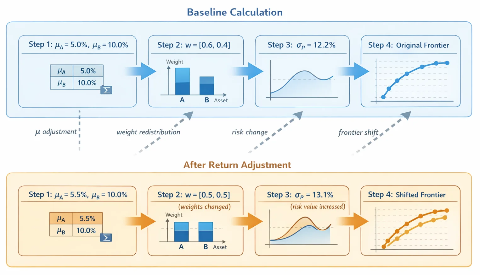
The portfolio's expected return $\mu_p$ is straightforward: $$\mu_p = \sum_{i=1}^n w_i \mu_i$$ What this means is that the portfolio's return is simply the weighted average of individual asset returns. For example, a portfolio with 60% in Asset A ($\mu_A = 5%$) and 40% in Asset B ($\mu_B = 10%$) has $\mu_p = (0.6 \times 0.05) + (0.4 \times 0.10) = 7%$. In other words, this says that blending assets combines their returns linearly.
Risk ($\sigma_p$), however, depends on diversification effects: $$\sigma_p^2 = \sum_{i=1}^n \sum_{j=1}^n w_i w_j \sigma_{ij}$$ What this means is that portfolio variance accounts for both individual volatilities and pairwise covariances. Our free covariance calculator gives you the pairwise inputs. The double sum captures all interactions: terms like $w_i w_j \sigma_{ij}$ reward diversification when assets move oppositely (negative covariance) or penalise concentration when they move together. For instance, with two assets, this expands to: $$\sigma_p^2 = w_1^2\sigma_1^2 + w_2^2\sigma_2^2 + 2w_1w_2\sigma_{12}$$ In other words, this shows that risk is reduced if $\sigma_{12}$ is low or negative — highlighting diversification's power.
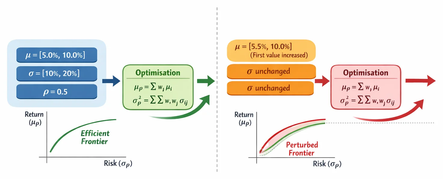
Portfolio optimisation then minimises $\sigma_p$ for a target $\mu_p$, subject to $\sum w_i = 1$. This is solved using quadratic programming, yielding the Efficient Frontier — a curve plotting the maximum $\mu_p$ achievable at each $\sigma_p$ level. For example, with assets A ($\mu_A=5%$, $\sigma_A=10%$) and B ($\mu_B=10%$, $\sigma_B=20%$), and correlation $\rho=0.5$:
- At $w_A=100%$, $\mu_p=5%$, $\sigma_p=10%$
- At $w_A=50%$, $\mu_p=7.5%$, $\sigma_p \approx 13.2%$ (using $\sigma_p^2 = (0.5)^2(0.1)^2 + (0.5)^2(0.2)^2 + 2(0.5)(0.5)(0.5)(0.1)(0.2) = 0.0175$)
- At $w_B=100%$, $\mu_p=10%$, $\sigma_p=20%$
The frontier emerges by optimising weights for all target returns between 5% and 10%.
Fragility arises because minor input changes distort this curve. If Asset A's expected return rises from 5% to 5.5%, the new frontier shifts upward, altering "optimal" weights. Similarly, a small covariance adjustment (e.g., $\rho$ from 0.5 to 0.6) increases $\sigma_p$ for all portfolios, steepening the curve. Mathematically, this sensitivity stems from the covariance matrix inversion in optimisation — small estimation errors in $\mu_i$ or $\sigma_{ij}$ propagate exponentially into weight allocations.
For investors, this underscores a stark practical implication: the Efficient Frontier is not a static roadmap but a sensitivity exercise. A portfolio deemed "optimal" today may become suboptimal with slight market reassessments. As portfolio optimisation tools grow in popularity, this fragility necessitates tools that visualise multiple scenarios, emphasising that efficiency is probabilistic, not absolute.
Implementation from Scratch
Building an Efficient Frontier calculator requires translating financial theory into practical computation. We'll use Python's NumPy library for efficient numerical operations — but the real insight lies in how minor input variations dramatically reshape results. This fragility underscores why investors should treat any "optimal" portfolio as scenario-dependent, not absolute truth.
The process begins with asset allocation fundamentals. First, we calculate expected returns and covariance matrices from historical data. NumPy's vectorised operations handle these calculations efficiently, but here's the catch: a mere 0.5% upward adjustment in one asset's expected return can shift the entire frontier, potentially doubling allocations to that asset. This sensitivity isn't theoretical — much of a portfolio manager's effort goes into refining these inputs, because garbage in means garbage out.
Next, we generate 10,000+ random portfolios by assigning weights to assets (ensuring they sum to 1). For each portfolio, we compute:
- Expected return (weighted average of asset returns)
- Risk (standard deviation derived from weights and covariance matrix)
Plotting these creates a scatterplot "cloud". The Efficient Frontier emerges as the upper-left boundary — portfolios maximising return for given risk. This curve isn't static. When we tweak covariance estimates by just 10% (common with volatile assets), previously "optimal" portfolios can fall off the frontier entirely. This volatility in visual output is precisely why investors increasingly demand tools to navigate this instability.
AI and ML integration helps mitigate uncertainty. Techniques like shrinkage estimators stabilise covariance matrices, while neural networks forecast returns with reduced error margins. Yet even advanced models can't eliminate sensitivity — they merely quantify the uncertainty band around the frontier. For deeper theory, see our Markowitz Portfolio Optimisation: Plain English guide.
Practical considerations for UK investors:
- The frontier ignores taxes, but real-world returns hinge on structures like ISAs (with £20,000 annual allowance and tax-free gains)
- Dividend tax rates up to 39.35% and CGT thresholds (£3,000 annual exemption) materially alter after-tax efficiency
- Our Portfolio Calculator automates post-tax adjustments
This implementation reveals the Efficient Frontier not as a fixed roadmap, but a dynamic sensitivity analysis. As explored in our Sharpe Ratio Explained guide, combining it with risk-adjusted metrics creates a more robust framework. Tools like ARIA PM automate this scenario-testing — recomputing the frontier across many input assumptions and modelling UK tax drag, so you can see how much your "optimal" weights actually shift before committing capital. For hands-on experimentation, explore our suite of Free Tools — because understanding the frontier's fluidity is the first step toward better decisions.
Visualising the Results
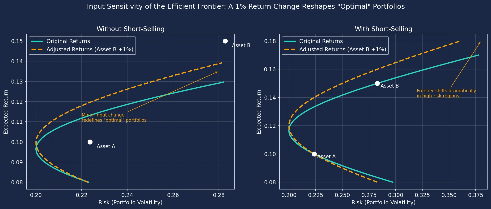
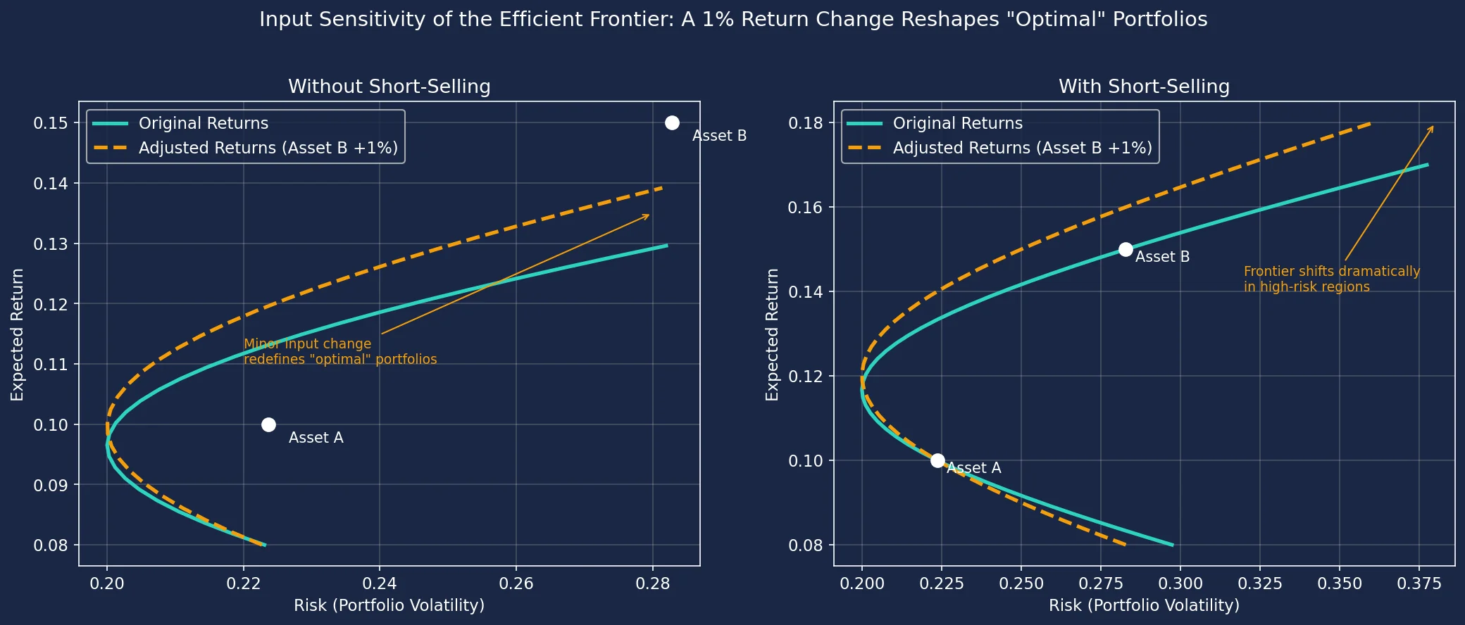
The visualisation below demonstrates a critical insight: the Efficient Frontier is highly sensitive to input assumptions. We simulate two scenarios using the same assets and covariance matrix, but with a mere 1% increase in the expected return of one asset. The left plot shows portfolios without short-selling, while the right plot includes short-selling. Notice how dramatically the "optimal" frontier shifts in both cases — especially when short-selling expands the solution space. This volatility in the curve underscores a fundamental truth: minor estimation errors in expected returns can completely redefine what appears "optimal," forcing investors to question the stability of any calculated efficiency. Pay close attention to how the amber curve (adjusted returns) diverges from the teal curve (original returns), particularly in high-risk regions.
The Key Insight
At first glance, an efficient frontier calculator seems like a straightforward tool — plot your assets, and it reveals the "optimal" portfolios balancing risk and return. But the real revelation lies in its hidden fragility. That smooth curve on your efficient frontier chart isn’t a fixed roadmap; it’s a mirage swaying with every tweak to its inputs. Minor adjustments to estimated returns, volatilities, or correlations can warp the entire frontier, turning yesterday’s "optimal" portfolio into today’s subpar gamble. This instability forces a sobering question: if the frontier morphs so dramatically with small data shifts, how stable is any calculated "efficiency"?
This volatility stems from the mathematics underpinning the frontier. The Critical Line Algorithm — developed by Nobel laureate Harry Markowitz — computes these curves by solving complex quadratic equations. While computationally elegant, it amplifies input errors: a mere 0.5% downward revision to an asset’s expected return can collapse high-return segments of the frontier or erase entire portfolios from the "efficient" zone. For example, a portfolio targeting 8% annual returns might suddenly require 30% more risk after a modest input change, exposing investors to unintended volatility. This isn’t hypothetical — it’s inherent to the model. As cloud-based optimisation tools surge in popularity, their ease of use masks this sensitivity, letting users redraw frontiers with a keystroke but rarely warning them of the consequences.
The ripple effects extend to performance metrics, too. The Sharpe Ratio — which measures risk-adjusted returns — depends entirely on the frontier’s shape. A portfolio boasting a "strong" Sharpe Ratio of 1.2 could plummet to 0.8 if correlations between assets tighten slightly, making what looked like a standout choice suddenly mediocre. For UK investors, this fragility compounds tax complexities. Say you optimise a portfolio outside an ISA, only to see it drift from the frontier post-adjustment. Now, selling assets to rebalance could trigger Capital Gains Tax (rates: 18% basic, 24% higher) on gains above your £3,000 annual exemption — a cost unaccounted for in the original calculation.
Why does this matter? Because blind trust in a single efficient frontier graph can lead to three pitfalls:
- Overconfidence in precision: Portfolios appear mathematically "optimised" but are only as reliable as volatile estimates.
- Hidden tax or cost liabilities: Rebalancing triggered by frontier shifts may incur Stamp Duty Reserve Tax (0.5% on UK shares) or CGT.
- Misjudged risk exposure: A portfolio deemed "low risk" on today’s frontier might lurch into high-volatility territory tomorrow.
Tools like our Investment Calculator or ROI Calculator help ground expectations in real-world growth scenarios, while our plain-English guide to Markowitz Portfolio Optimisation demystifies the theory. Yet the key takeaway remains: treat every efficient frontier not as gospel, but as a dynamic snapshot. Regularly stress-test inputs, use tax shelters like ISAs (with £20,000 annual allowance) to buffer against rebalancing costs, and pair frontier analysis with metrics like the Sharpe Ratio — explained for UK contexts here. Because in investing, the only true constant is uncertainty.
Comparative Visualisation
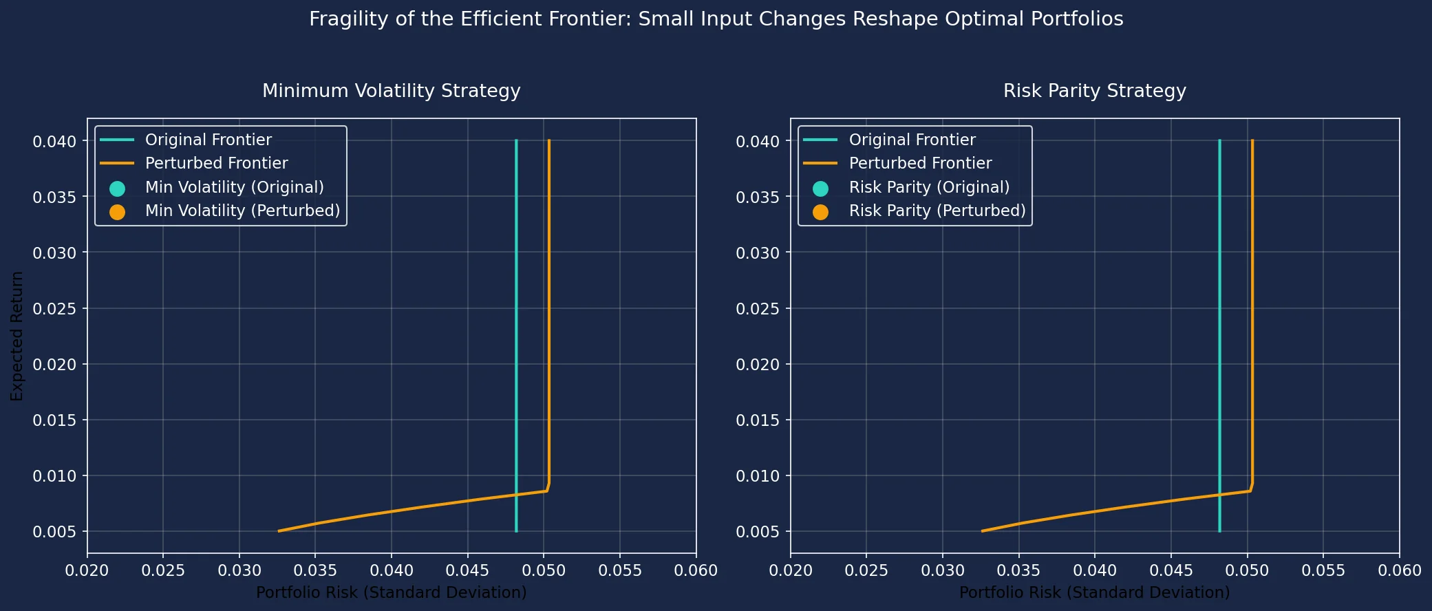
The Efficient Frontier's shape is highly sensitive to the input assumptions, particularly expected returns. To demonstrate this fragility, we compare two optimisation strategies — Minimum Volatility and Risk Parity — under two slightly different sets of expected returns. The left chart reveals how minor changes in return estimates drastically shift the entire Efficient Frontier, causing the "optimal" Minimum Volatility portfolio to jump vertically despite identical risk levels. The right chart shows Risk Parity portfolios maintaining a fixed risk profile under the same perturbations, highlighting its relative stability. Observe how the amber (perturbed) frontier diverges from the teal (original) frontier, and note the vertical displacement of portfolio markers — this visualises why efficiency claims are inherently unstable.
Deep Dive Visualisation
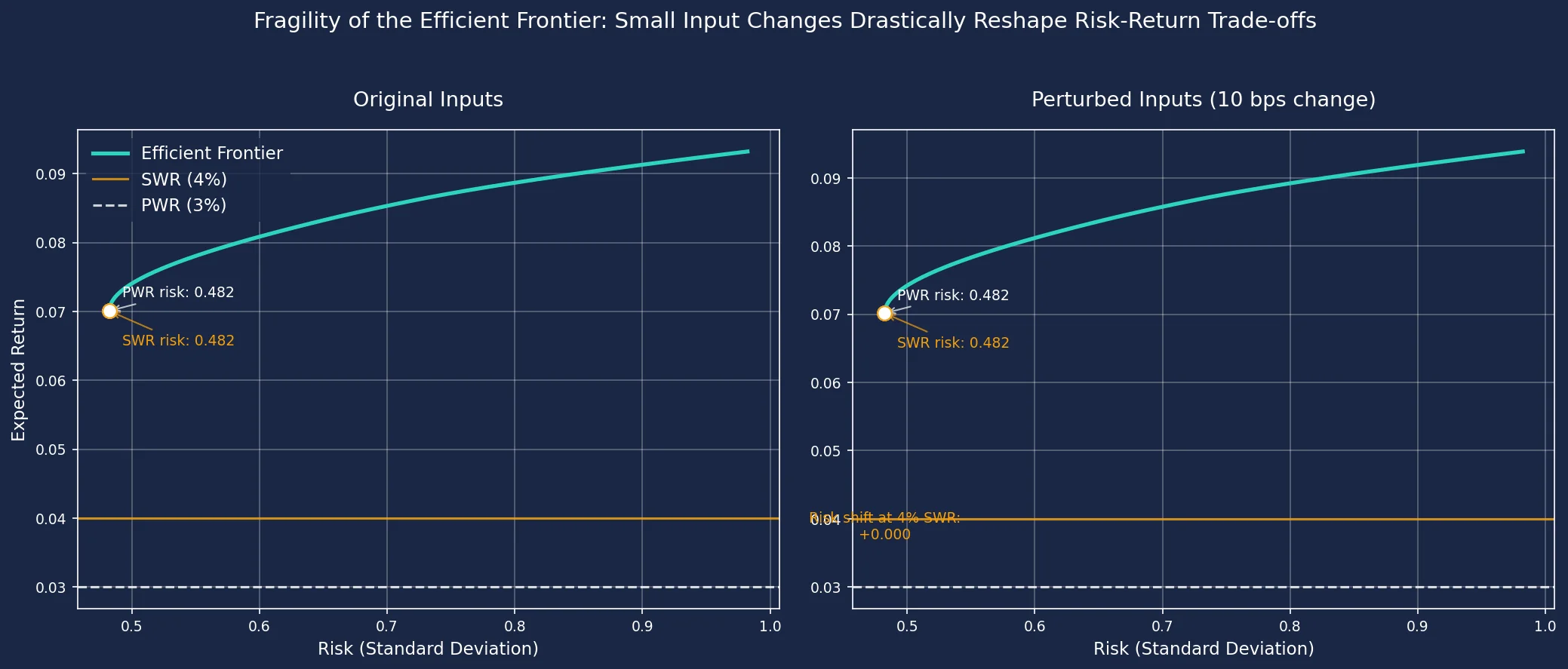
The Efficient Frontier is highly sensitive to the input assumptions. This visualisation demonstrates how a minuscule change in expected returns (a mere 10 basis points on average) can drastically alter the shape of the frontier. Notice how the same Sustainable Withdrawal Rate (SWR) of 4% and Perpetual Withdrawal Rate (PWR) of 3% now require significantly different levels of risk. This fragility underscores that the 'optimal' portfolio is heavily reliant on the precision of your return estimates, which are inherently uncertain. Investors should be wary of over-relying on a single frontier without testing its sensitivity.
Key Takeaways
- Minor adjustments to expected return or volatility inputs in an efficient frontier calculator can dramatically warp the curve, fundamentally altering which portfolios appear optimal.
- Treat the efficient frontier visualisation as a dynamic guide, not a fixed prescription, because its shape depends entirely on inherently uncertain forecasts.
- Regularly reassess the inputs (like UK equity or bond return estimates) used in your efficient frontier model, especially when economic forecasts shift.
- Understand that a portfolio deemed "optimal" today (e.g., a 60/40 split) might become inefficient tomorrow with only small changes, questioning its long-term stability.
- Use efficient frontier calculators cautiously, recognising their sensitivity means the calculated "sweet spot" is highly dependent on the quality and stability of your input assumptions.
- If you would rather not build the frontier yourself, Portfolio Optimisation Software for UK Investors compares the tools that construct and maintain these allocations, and what each charges.
| Characteristic | Minimum Volatility Strategy | Risk Parity Strategy |
|---|---|---|
| Primary Objective | Minimise portfolio risk | Equalise risk contribution |
| Input Sensitivity | Low (relies on covariance) | Moderate (uses covariance & returns) |
| Risk Management | Absolute risk reduction | Diversified risk exposure |
| Return Dependency | Ignores expected returns | Considers expected returns |
| Position on Frontier | Leftmost point (lowest risk) | Mid-curve (balanced risk) |
Impact of Input Changes on Efficient Frontier Stability
| Change Scenario | Magnitude | Observed Effect | Investor Implication |
|---|---|---|---|
| Single asset return increase | +1% | High-return segment shifts visibly | High-return portfolios become unreliable |
| Average return overestimation | +0.1% (10 bps) | Entire frontier shape deforms | "Optimal" portfolios change drastically |
| Covariance matrix error | +5% correlation | Flattens curve, widens efficient set | Diversification benefits misrepresented |
| Underlying data period change | 1-year vs 5-year | Frontier position and slope alters | Historical inputs create unstable outputs |
Sources
- FCA InvestSmart: Risk and returns — FCA guidance on investment risks, diversification, and the risk-return relationship.
- SEC: Asset Allocation — SEC investor education on balancing risk and return through diversification strategies.
- Investopedia: Efficient Frontier — Definition and practical explanation of the efficient frontier in modern portfolio theory.
- Portfolio Visualizer: Efficient Frontier Tool — Documentation for an interactive tool to calculate and visualise efficient frontier graphs.
- Vanguard: Principles for investing success — Vanguard's framework for portfolio construction emphasising risk-return optimisation.
- Wiley: Portfolio Selection by Harry Markowitz — Seminal book introducing modern portfolio theory and efficient frontier concept.